Difference between revisions of "W Interface"
Jump to navigation
Jump to search
| Line 3: | Line 3: | ||
<!--T:1--> | <!--T:1--> | ||
| − | ScanWay's Wizard interface has been designed to be immediate and user friendly. | + | ScanWay's Wizard interface has been designed to be immediate and user-friendly. |
<!--T:2--> | <!--T:2--> | ||
| Line 9: | Line 9: | ||
<!--T:3--> | <!--T:3--> | ||
| − | While the tools and the | + | While the tools and the visualized messages or items may change, the interface's structure is always the same. |
<!--T:4--> | <!--T:4--> | ||
Latest revision as of 14:14, 11 January 2018
ScanWay's Wizard interface has been designed to be immediate and user-friendly.
While the tools and the visualized messages or items may change, the interface's structure is always the same.
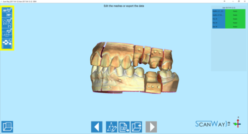
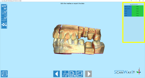
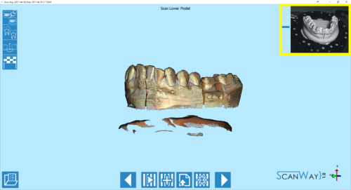
Starting from the upper left corner there are:
- The wizard steps
- Organised in icons that show the progression of the wizard and of the project.
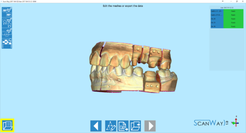
- The Project Options
- The options regarding the project can be accessed using the
 button in the lower left corner of the interface.
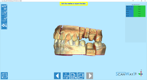
- The Instruction
- Piece of written text that guides the user giving information on the project's steps and how to carry them out.
- The 3D View
- A view of the selected objects with which the user can interact.
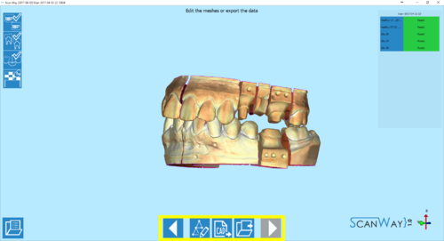
- The Action Toolbar
- A set of tools and actions that vary according to the step the user is on. The main action bars are for scanning new elements, editing the images, Aligning or editing the meshes.
- The mesh or Live view
- Finally in the upper right corner there is the list of the available meshes for this project or, during scanning, the live view of the cameras.

